


 Alcohol is one of the most commonly advertised products on the planet. During major sporting events such as the Superbowl, the World Cup and the Olympics, companies spend millions on TV advertisements, and also product advertisements in banner and billboard format at the sporting venue itself. However, because alcohol is a liquid, it can be very difficult to design around since liquid stock images require significant more attention during isolation and blending in order to appear realistic.
In this tutorial, you’ll learn how to create a vibrant, colorful alcoholic product advertisement in Adobe Photoshop, using some easy techniques and quality stock images. You’ll learn how to deal with liquid stock images, how to take a brand image and create elements to match, and how to work with colors and composition for a brilliant result.
As a disclaimer, this tutorial is in no way an endorsement of Kai Vodka, or any other alcoholic beverage brand, and the product is used merely in an illustrative fashion.
Tools Used
- Adobe Photoshop
Final Image Preview
To start off you will need to create a new Photoshop document and set the dimensions up as mine are in the below screenshot. To create a new document simply press ‘CTRL N’ on your keyboard or go to the file tab and select new.

Next we can head over and grab our liquor bottle stock; for this quick manipulation we will be using a shot of a Kai vodka bottle. Our stock can be found here : http://intoxicologist.files.wordpress.com/2009/01/kai-vodka-bottle-shot-dark.jpg
Once you have the stock just drop it into your new document; once its in your new document just simply move the stock around until its in the center of your canvas. The move tool is the ‘V’ key on your keyboard.

Next we will be adding in some color to our bottle. To add in the color we need to make a new layer which is ‘CTRL SHIFT N’ on your keyboard, so that we don’t mess up our stock. Once your new layer has been created we can grab the brush tool by pressing ‘B’ on your keyboard and right click. Once you right click a brush settings dialog should open; set your brush up as mine is in the below screenshot.

Now that our brush is set up we can go ahead and draw on top of our bottle. You don’t need to make any major shapes or anything just follow the outside lines of the bottle. And remember to stick mainly to red with a few quick dabs of yellow and orange. My brush layer looks like the below screenshot :

Now we can apply a Gaussian blur to feather everything up nicely, it will also help to blend the orange and yellow blobs to the red. So once you are satisfied with your doodles go to your filter drop down, select blur and finally Gaussian blur. Once you have done this we can apply a Gaussian blur with a radius of about 55-59.

After you apply your Gaussian blur your image should appear feathered and the blobs should have almost a gradient quality about them. Don’t worry if the blobs go off the sides of the bottle since our layer styles wont affect pure black. My Gaussian blurred result came out looking like the below screenshot.

Now we can set this layers blending mode to color at 100%. This should add some color to the midtones of our bottle, do note that this will not color the 1005 whites in the scene though. Once I applied the Gaussian blur and changed the layer style my result came out looking like the below screenshot.

And now we can duplicate this layer and set the duplicates blending mode as ‘Soft Light’. This should create a stronger contrast between your hues and help the over all saturation of the color. My result came out looking like the below screenshot.

Now if you like the way your bottle looks you can stop here, however I didn’t so I went ahead and duplicated these layers and moved them around to the other side of the bottle like in the below screenshot. To enable the move tool just simply press ‘V’ on your keyboard and then click and drag the layer of your choosing.

Now we need to start adding in some water splashes to give it a more dynamic feel. So we can head over to Sxc.hu and get this stock http://www.sxc.hu/browse.phtml?f=download&id=1180590
Once you have copied this stock into your canvas we need to desaturate and auto level the stock. To do this press ‘CTRL SHIFT U’ followed by ’CTRL SHIFT L’ on your keyboard. This will turn our image into a black and white image and then adjust the levels automatically (the white %,black % and midtone %).

Now we can set this layers blending mode to screen. This will cause only the white and greys in the image to become visible, everything that was once black will now be invisible.

Now we need to move the stock (the move tool is ‘V’ on your keyboard) so that it appears as if the splash on the far right hand side is wrapping around our bottle. Once you have that done your canvas should look similar to mine in the below screenshot.

Now we need to clean our stock up. So go ahead and press ‘E’ on your keyboard to enable the eraser tool. Once you have enabled the eraser tool we need to right click on the canvas and set our brush up as we did previously with the brush tool. However this time we will be creating a large semi hard brush like the below screenshot.

Now just erase everything on the left hand side of the bottle as well as everything beneath the bottle leaving nothing but the far right splash.
Now we can add some color to our water by pressing ‘CTRL U’ on our keyboards this will bring up the hue editor.With the hue editor open we can set up the hue editor like it is in the below screenshot.

Your canvas should now look something like mine in the below screenshot.

Now we need to add something to the document to fill it up some; I will be using a martini glass. I got my martini glass off of iStock (hence it’s not provided here), however you can find them easily all over the web, primarily sxc.hu, deviantart.com and Google images.

Since my martini was shot with a black background I can just drag it into my document and set it up as a screen like we did with the water layer. However if your martini glass (or whatever you choose to use) Is not on a black back drop you can simply use the magic wand tool and a layer mask to remove all of the white.

Now you need to add more splashes to your bottle and background. I have compiled a small list of splash stocks that you can use to finish your ad below. This time however vary your hue setup to create some nice color contrasts.
My splash progression is shown below in the following screenshots:


This step is essential to creating an atmosphere for your piece as well as setting the tone for the final piece. I choose to create the bulk of mine in red/blue and pink. But you can choose any color combos you like for this as long as they don’t cause to much contrast amongst one another.
Next we will add a cherry; you can find the cherry stock at:http://files.wla.org/igs/wale/conf07/Picts/Cherry.jpg
Once you have dropped the stock into your document just go ahead and press ‘W’ on your keyboard to enable the magic wand tool. With the magic wand tool enabled just click the white that surrounds the cherry and press delete on your keyboard. This should remove all the white that surrounds your cherry, however if it does not then just grab your eraser tool (which is ‘E’ on your keyboard) and clear out any remnants that were left.


Now that your cherry is isolated we can go ahead and duplicate this layer and set its blending mode as ‘Overlay’. This will make our blacks darker, add contrast and just enhance the lighting over all for our cherry.
Now just free transform your cherry (to enable the free transform tool press ‘CTRL T’ on your keyboard) to a appropriate size and place it! I think its best to place your cherry about halfway down in your layer stack. This way it will be beneath some of your splashes but not all of them, thus creating a sense of depth and this will add to the illusion that the berry is flying in the water.

Once you decide on placement and you have sized it down, we can apply a drop shadow. To apply a drop shadow click the small ‘F’ on your layer platelet. Once you have clicked the small F, simply click drop shadow and set yours up as mine is in the below screenshot.

Now we can duplicate this layer and move the newly created cherries around on our canvas. Again I tried to keep some of mine in the water and others out of the water for this.


Next we will head over to SXC once again, this time however we will be grabbing some chile stocks. You can find the chile stocks at : http://www.sxc.hu/browse.phtml?f=download&id=1002105
Once you have grabbed the chile stocks grab them and paste them into your canvas the same way we did all of the other stocks.

Now that its in our document we can go ahead and isolate these the same way we isolated our cherries. We will also place a chile (or more if you like) in the exact same way. My result came out looking like the below screenshot.

Next we will head out and grab a strawberry and repeat the isolation/placement technique from the last few stocks. Our strawberry stock can be found at http://commentisfree.guardian.co.uk/strawberry.jpg


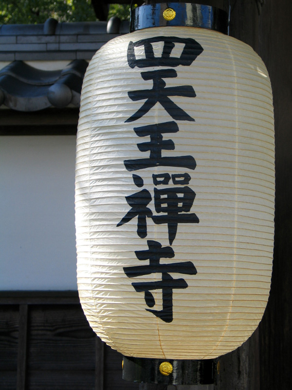
And finally for the last bit of stock we will head out yet again but this time we will grab a paper lantern stock. Our paper lantern stock can be found athttp://upload.wikimedia.org/wikipedia/commons/0/09/Paper_lantern.jpg

Isolation for the paper lantern stock is essentially the same as before, however this time it will be more complex; In my version I removed the caps to my lantern to make things look better and to ease my workflow, but this is not required.
Once you have the lantern isolated you can duplicate it a few times and make a row as if the were hanging horizontally/vertically or you can just use one and leave it as is. I decided to duplicate mine twice and draw a thin white line (I used the standard 3px brush for this) connecting all of them, I then just placed them like all of our other stocks to finish off this piece.

My result came out looking like the below screenshot, but if yours looks different it is no big deal as long as you had fun and learned a thing or two! Also just because I’m happy with the way the image looks now dosen’t mean you will be, if you want you can add in much much more to this to create a more dynamic and full ad, remember with a piece like this or any piece really experimenting is the key to creating unique results!


0 komentar:
Posting Komentar